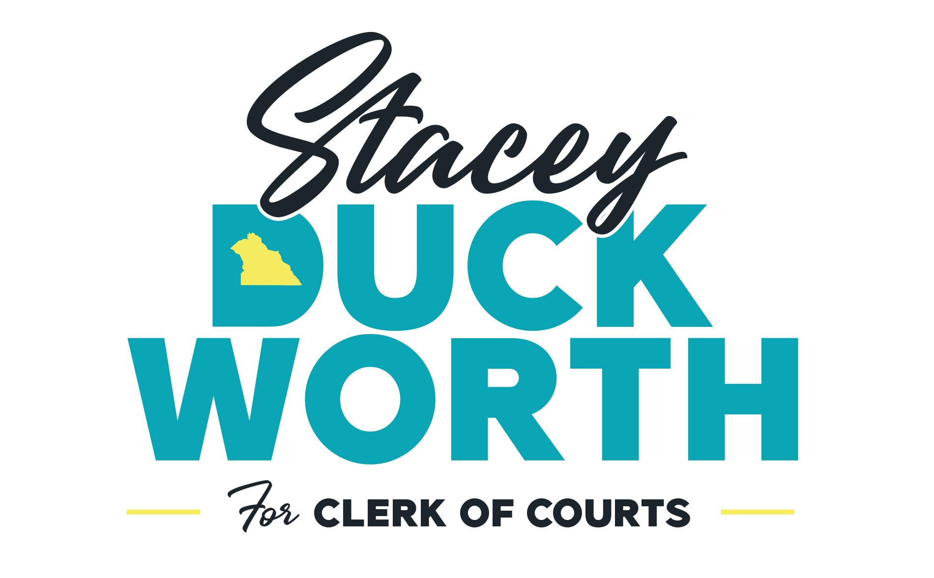

During the York Municipal Election of twenty nineteen, I volunteered to help with a local politican campaign and her branding. Stacey Duckworth was running for Clerk Of Courts and wanted to bring a fresh voice to her "fresh voice" campaign. She didn't want to use the standard colors and typefaces associated with political campaigns. So the first step was finding a combination of typefaces and a simple icon that worked for the client.

From those original concepts we had a winner, albeit with a small change to where the york icon was located. With that edit in place we played around with color schemes, and ultimately settled on this fun combination of two blues and a yellow. This helped us get away from the typical red, white, and blue colors of politics, had a nice airy feeling to it, and is also a fun nod to the colors of Pennsylvania.

After the logo itself was settled on, I then developed some alternate graphics that could be used for various applications. The graphics below were used for various things including shirts and buttons. The base branding was also used for yard signs, which I unfortunately have no photos of.

